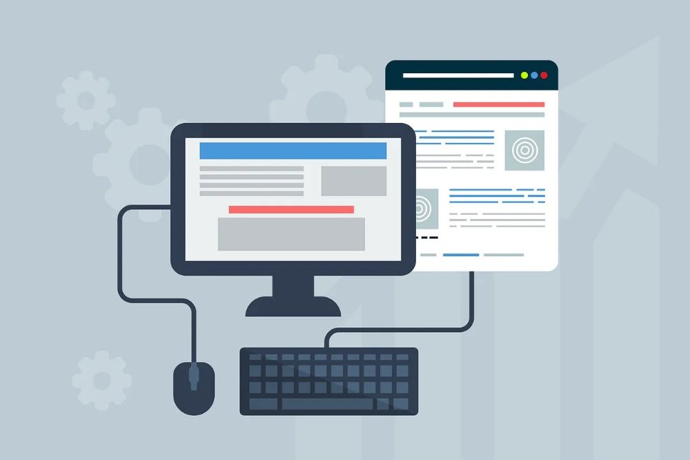


More people browse websites on smartphones and tablets than ever before, so responsive web design is essential. A mobile-friendly website automatically adjusts its layout, images, and text to fit different screen sizes.
If visitors need to zoom in, scroll sideways, or struggle to click buttons, they may leave the website quickly. Responsive design improves usability and creates a more professional experience.
When building a website, always test it on desktop, tablet, and mobile devices. Simple navigation, readable text, properly sized buttons, and optimized images can make a big difference.
A responsive website is not only easier to use, but it can also support better SEO and improve the overall performance of your online presence.